Well here we are…it’s the sixth month of 2014 [halfway thru the year already?!] and …
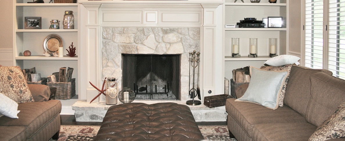
cottage style kitchen & great room – before & after
I’m finally posting some before and after photos from the cottage style kitchen and great room renovation we did. The project really turned out beautifully! Our client purchased this home years prior near the beach and had always envisioned transforming the 80’s style decor/layout into an open concept cottage style interior. Our client also loves to cook, so the function and layout of the kitchen played a major role in the new plan.
We were so glad she chose us to help bring her dreams to reality!
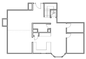
Existing Plan:
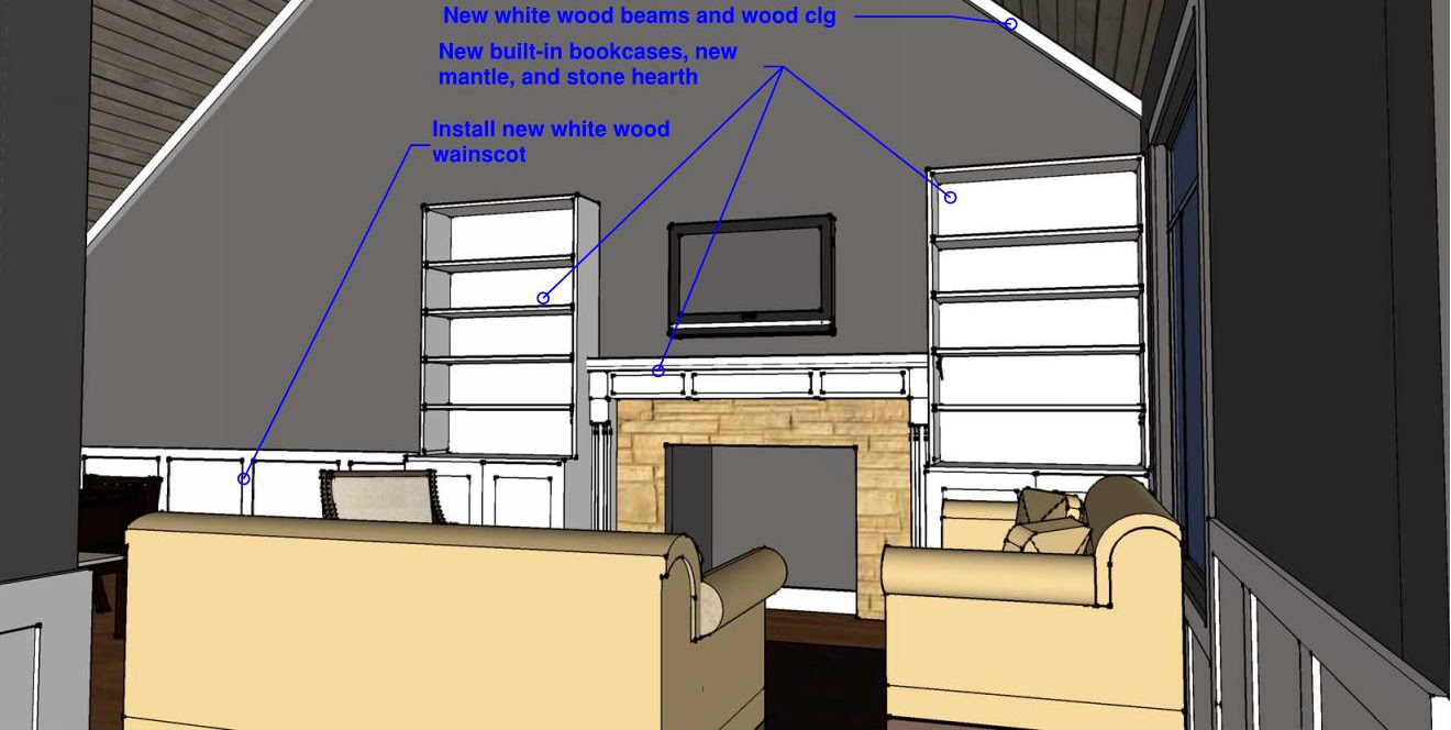
Conceptual Plans:

Kitchen:
The existing kitchen was somewhat dark and closed off (see photo below). The photo on the left shows a wall behind a peninsula island; we completely removed that wall to open up the kitchen to the dining and living area beyond during the renovation.

A lot of older homes like this have little nooks and crannies that become seemingly useless space over time. In this renovation, we made sure to take advantage of every bit of the interior… transforming those wasted areas into useful, functional space!

In the photo below, you’ll see a bay window that faces a beautiful wooded back yard. Unfortunately no one ever really used that window… even the loveseat faces away from the view!


Living Room after – what a transformation!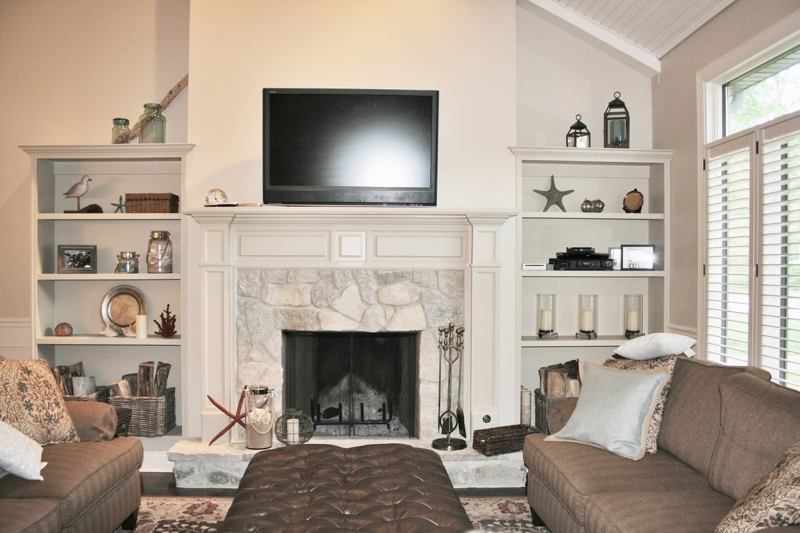


Dining Room:
To help define the dining area, we added a chandelier above the table, wainscoting, and the homeowner also purchased a rug. We also added decorative beams to the vaulted ceiling above, and by placing one central to the table, we were able to hide wiring for the chandelier.
Dining before – the wall to the left behind the china cabinet was a shared wall with the kitchen. This wall was removed and a bar peninsula was added.

Dining Room after!
The main foyer of the home also needed updating.
I love how it turned out!
surgery behind us… some fabulous LIFE before us!
We have much to be thankful for today! Derek made it thru his open heart …
another wave in this storm
I wanted to give you all an update on Derek’s health (I know, it’s been awhile). …
babygora = thegoralife
Well, as most of you already know, our family has sort of been “missing” from …
Monday March 24 – Home again
We ended up spending another 5 days in the hospital but have been home again …

