Our nursery project is finally complete! And by “complete” I mean that we had to force ourselves to STOP. Like literally. I think we could have worked on this little project forever…and not because it was complicated or drawn out…but because it was a JOY. We loved this one folks. For reals.
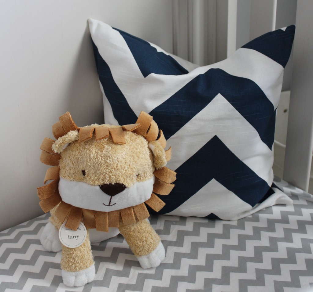
I think I forgot how much fun putting together a room could be until this little number came along. AND it’s a nursery. Which means we got to swoon over the cutest accessories and the sweetest little details {like “Larry” above…<3}. AND our client was awesome and let us basically do whatever we wanted!? Yep. They didn’t have a direction in mind for this nursery but they trusted us, which also means they let us MAKE stuff. Oh the joy!!!
Here’s where we started…
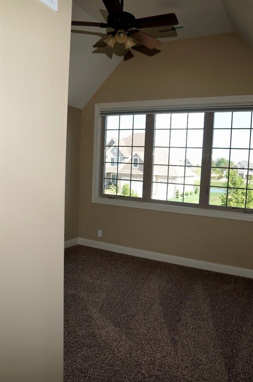
The existing room was a blank slate. Beige carpet, beige walls, white blinds, and a ceiling fan.
Existing Room:
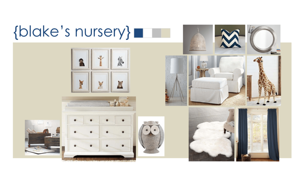
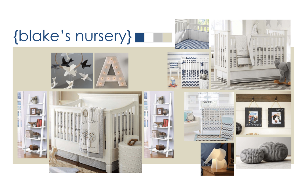
We came up with a design concept for them and helped them shop, shop, shop. We started with the most expensive of furnishings (like we always do for style and design) and then found better priced options where we could. For instance, we might have been pinning Restoration Hardware cribs to begin with, but that was more for concept and to get our design juices flowing. In the end, our Client actually found the perfect crib at babys-r-us…! We just led them thru the design process and gave them some specific details to look for…like bun feet, lol. (images to follow later in the post!)
Design Concept:
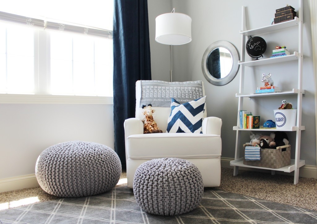
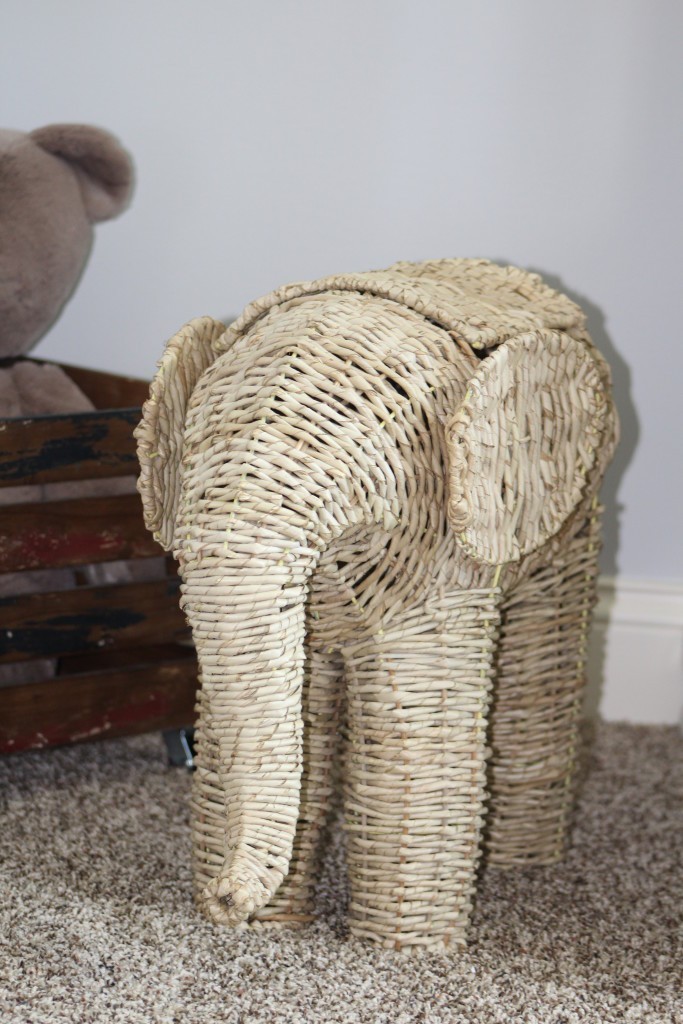
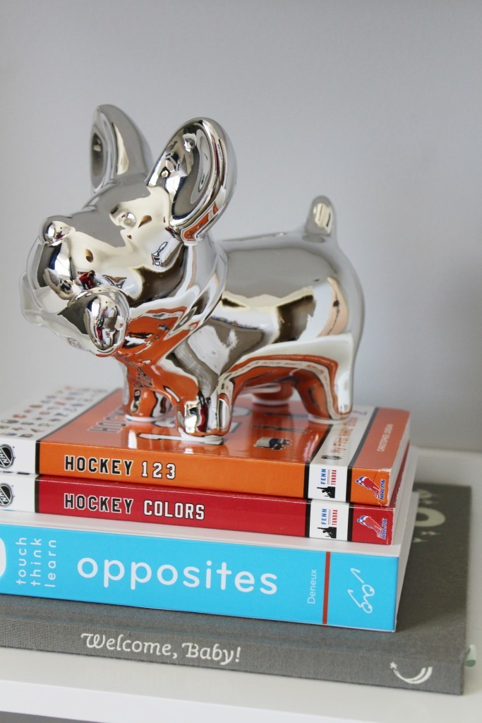
Since our Client is a huge lover of animals, we thought using animals as accents in the space would be perfect. From the start we knew we didn’t want this room to be overly themed in any way (I try to avoid themed rooms if it can be helped)… so we knew we were looking for pieces that didn’t necessarily come from the same store or line, but that would ultimately pull the look together without being too matchy-matchy. We also wanted it to be a room that would grow with him. Not too baby, not too grown up. And the room had to be a little glamorous…if you could see this little guy’s parents, you’d know why. They sparkle and don’t even try to. Seriously. They’ve got it going on. So we knew Blake’s little man room needed to be “man glammed”… if that’s even a phrase.
Custom Pieces:
We also got a little crazy and decided to make a few things ourselves…eeeek! Which is always one of my favorite parts. There’s something about using drills and saws and tape measures that’s just plain old exciting. But that’s usually only when our hubby’s aren’t around to watch and unknowingly “judge” of course. 🙂 They mean well…we know that! And we love them dearly. No doubt. But it’s sort of like trying to watch your husband ice a cake. Yes, he’s capable and could totally ice a mean cake. But it’s almost too painful to watch. There are tricks and short cuts they just can’t comprehend…and well…they’re just not as good at it. That’s how it is with our hubby’s and tools. They’re the experts. We’re just NOT. At least, not YET 🙂
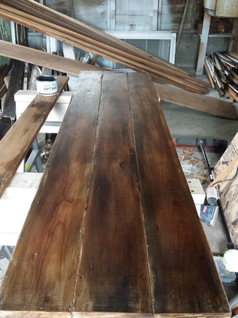
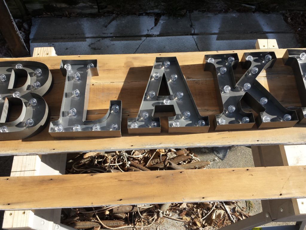
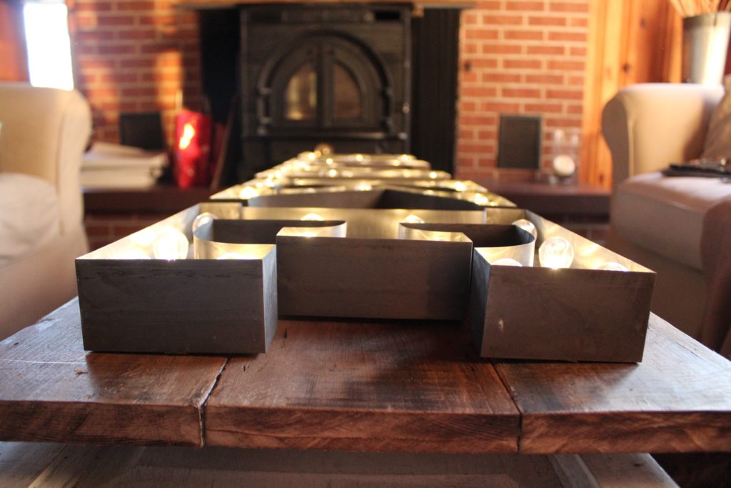
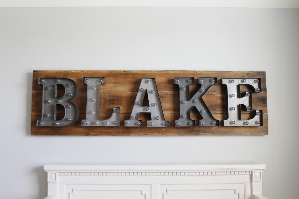
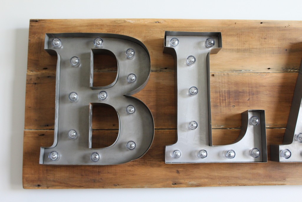
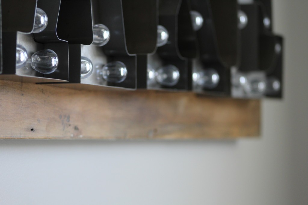
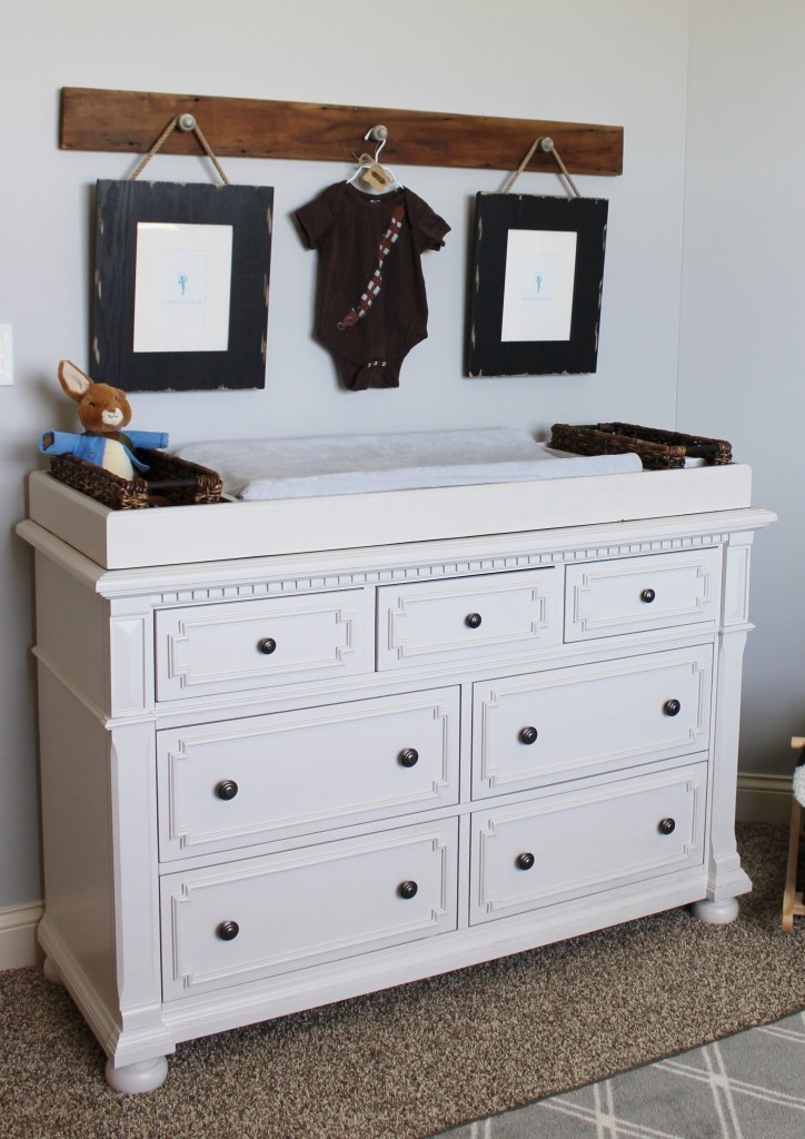
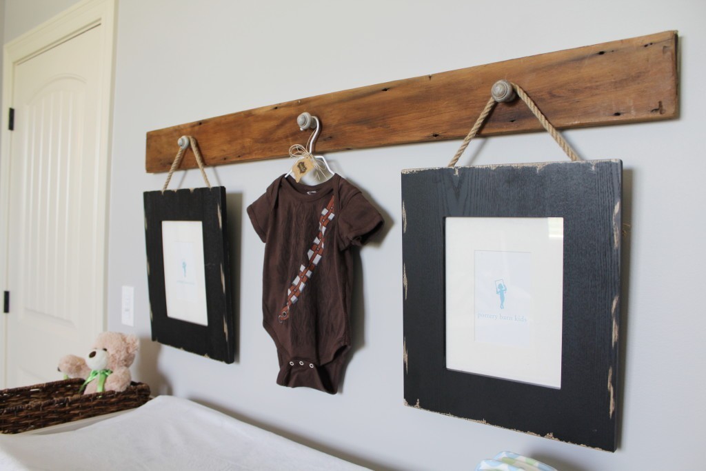
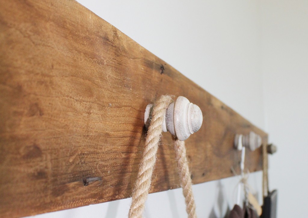
We made two things for Blake’s little nursery. A wood name-board for his fabulous light up letters…and a custom robe hook to hold frames and hats and cute little man stuff above his changing table. Both made of reclaimed wood, sanded and then waxed with a dark wax. See below!
Finished Nursery:
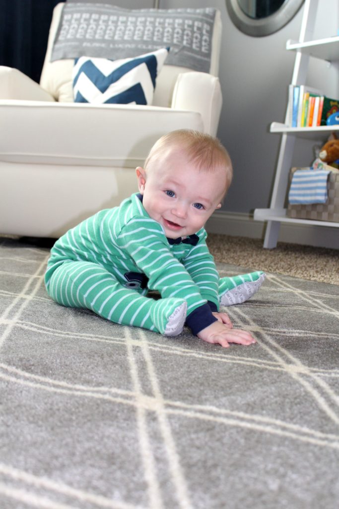
To start, let me introduce you to Baby Blake. Doesn’t he just melt your heart? He’s the sweetest, happiest little guy…as if you couldn’t tell, right? And he LOVES his room. Seriously…we took these photos the morning we finished the room. And he just sat there smiling, looking all around and grabbing at his new rug. 🙂
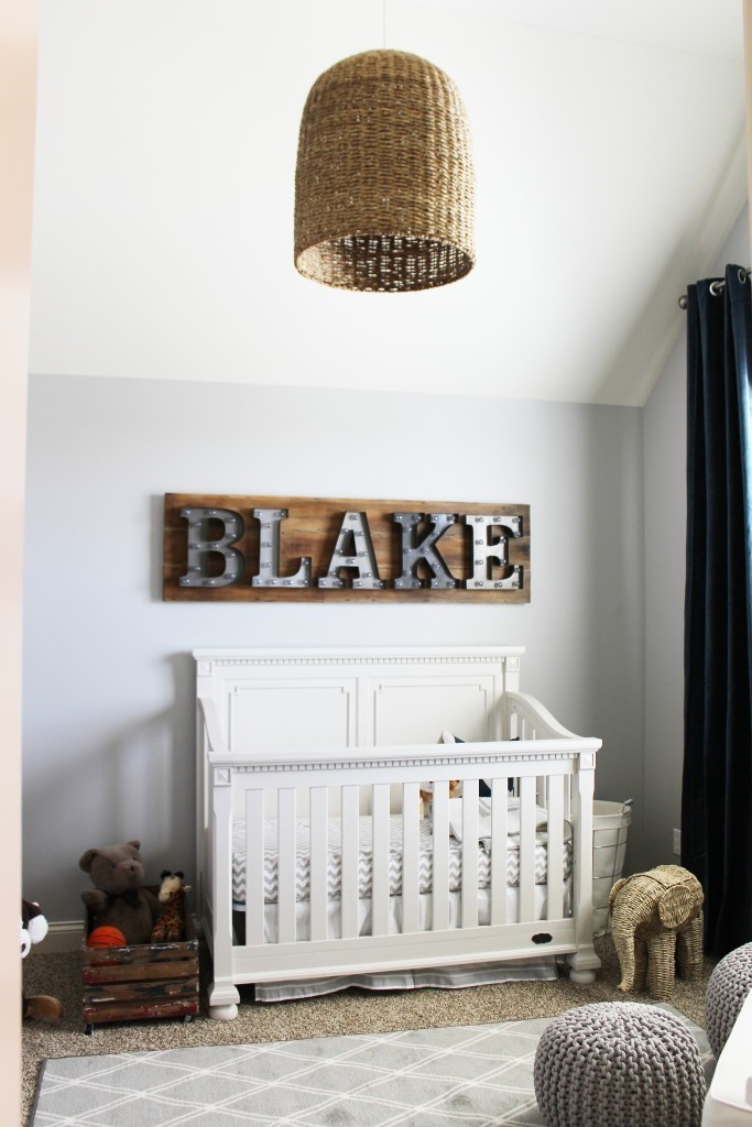
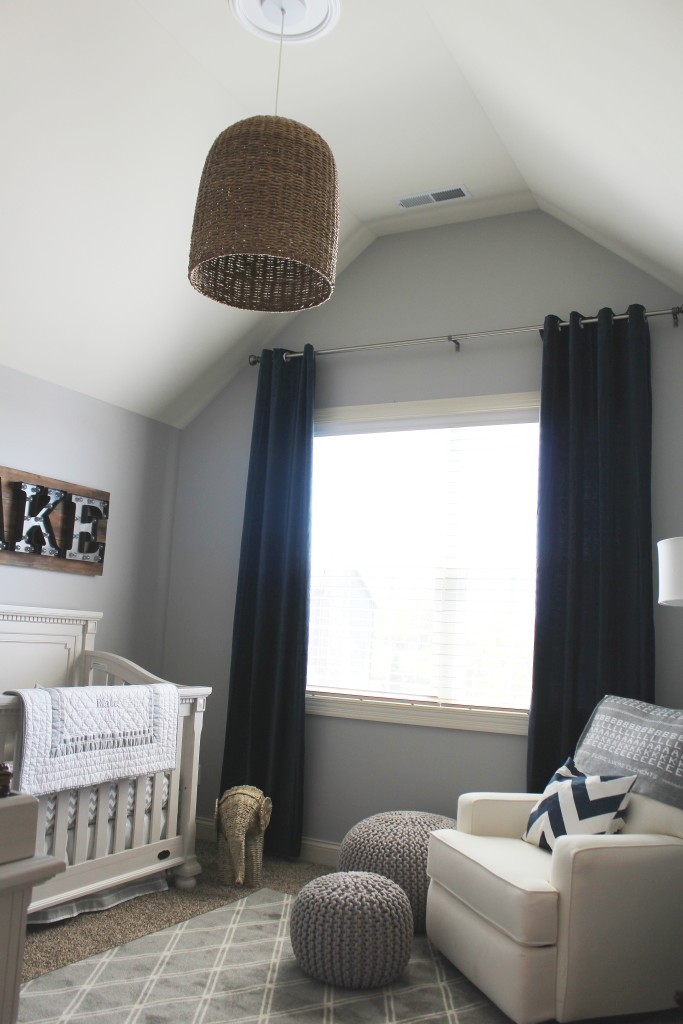
And now the less cute stuff, but the stuff I LIVE for…here’s the “after” shot of the room.
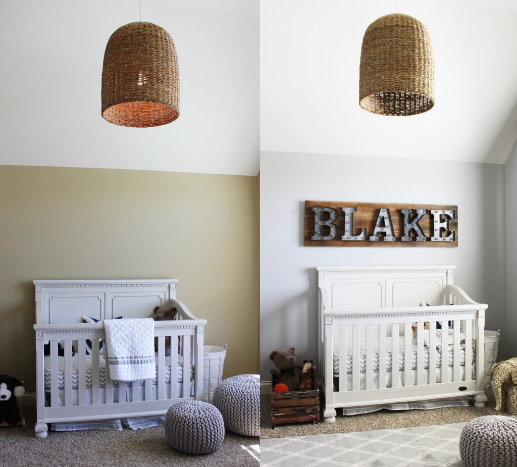
Here’s the before and after side by side photos. The “before” is before we painted and staged everything. I show you this because a lot of people would buy all the stuff for their room and leave it just like this “before” picture. Which is fine. But it could be SO much more with drapes and a rug and the right accessories and the right paint color.
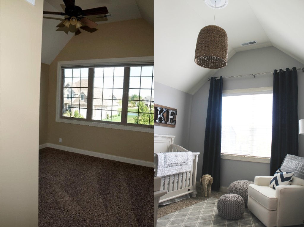
Here’s another before and after. The ceiling fan. Changing that element changed the whole room. It defined the space, brought things down a bit for a more intimate feel, added some texture and well…just made the room look “kool”.
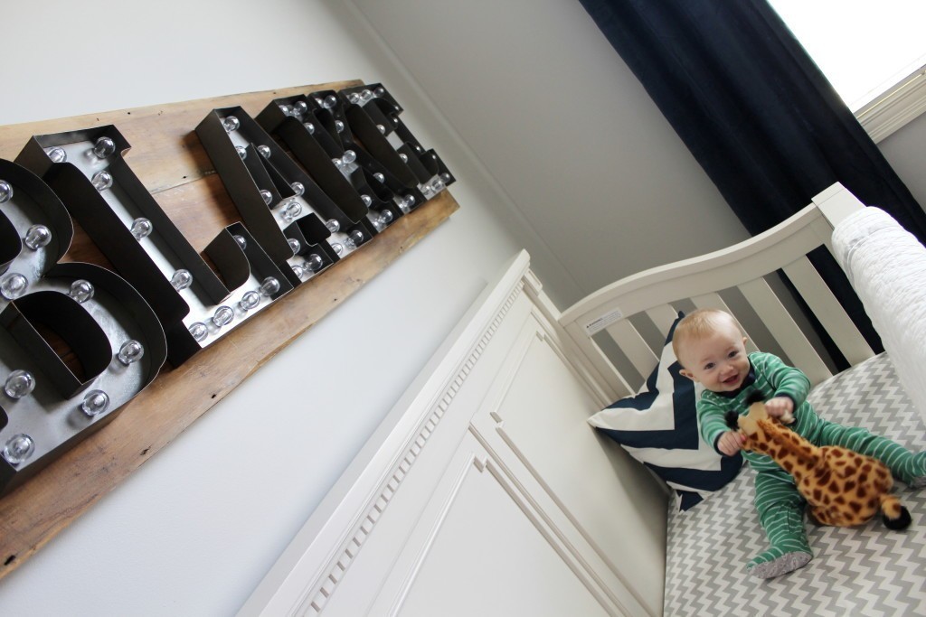
And here’s the custom name-board we made again.
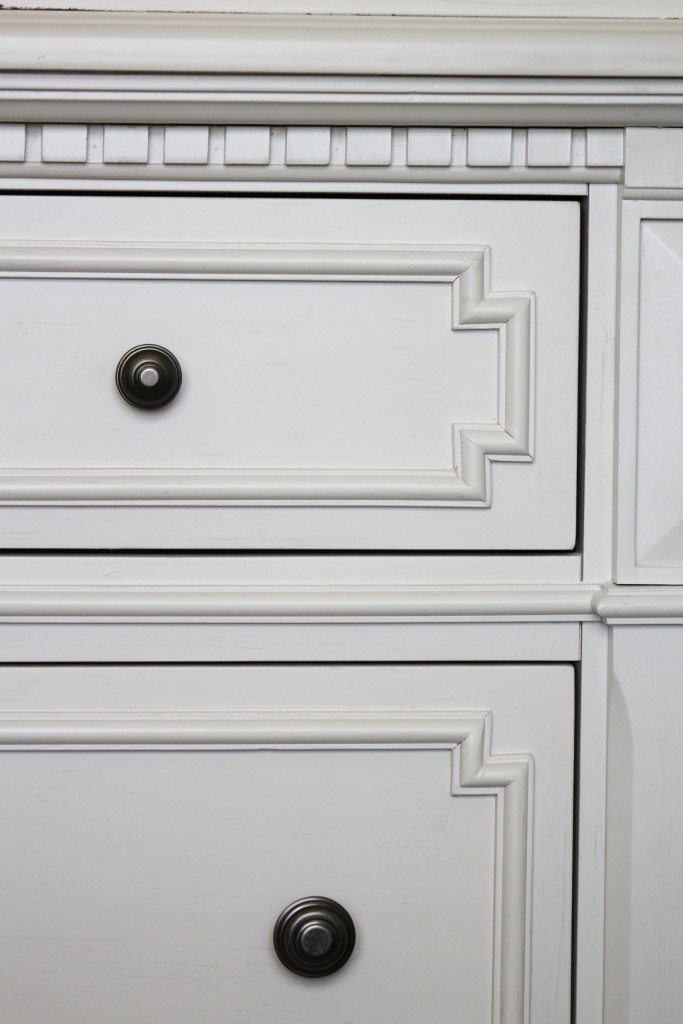
The details…it’s all about the details my friends. You can find pieces like this dresser at Babys-r-us…you just have to dig a little. Look at those pulls, and all the detailing on drawer fronts, and the bun feet. Oh, how I love a bun foot on a dresser 🙂
And here’s our custom robe hook we made from a piece of old wood, 3 pulls from Hobby Lobby and some rope.
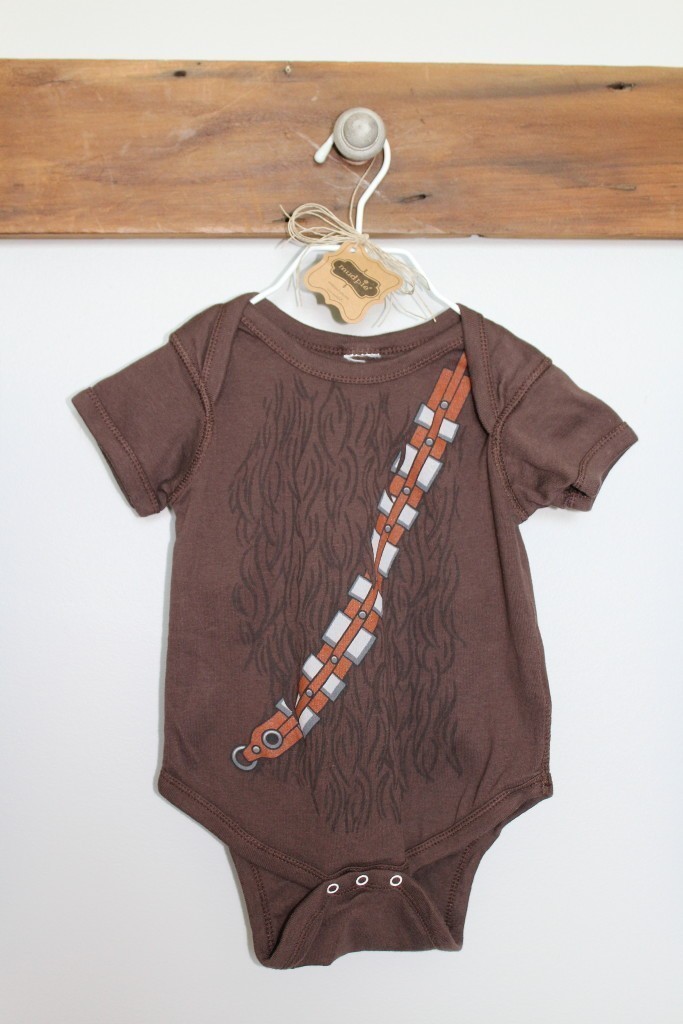
And seriously. This might be my most favorite part of the room. A CHEWBACCA onsie!!! {a gift I hear from Baby Blake’s Uncle Luke…nice job dude!}

Absolutely gorgeous!
So we’ll put together and that paint color is perfect! Nice job with the robe hook and name board!! Love the wicker elephant and light fixture.
Thank you!